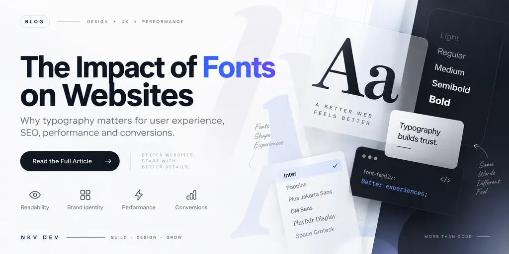
When designing a website, fonts are often treated as a small visual detail. Developers pick a font, adjust the size, and move on to more noticeable elements such as colors, images, animations, and layouts.
But typography has a much bigger impact on a website than most people realize.
The right font can make a site feel professional, modern, trustworthy, and effortless to use. The wrong font can make the same site feel confusing, outdated, difficult to read — or even slow.
Fonts influence how users read, understand, and interact with your website. From readability and accessibility to page speed, branding, and user experience, your font choices touch almost every part of a site.
In this guide, we explore the impact of fonts on websites, how typography affects user experience and performance, and how to choose better fonts for your next project.
Why Do Fonts Matter on a Website?
A website communicates through more than just words — the appearance of those words also says something.
A modern sans-serif font can make a technology company feel clean and innovative. A serif font can create a traditional, premium feeling. A playful display font might suit a creative brand but look completely out of place on a financial website.
Typography contributes to the personality and visual identity of a website.
But fonts aren’t only about aesthetics. A good font should:
- Be easy to read
- Work well across different screen sizes
- Use sufficient character spacing
- Support accessibility
- Load efficiently
- Match the brand
- Create a clear visual hierarchy
- Behave consistently across browsers and devices
Good typography should make a website feel effortless to use — never like an obstacle.
1. Fonts Have a Major Impact on Readability
A website’s main job is to communicate information. If visitors struggle to read it, the site has a usability problem — not just a design problem.
Font selection directly affects readability. Factors such as font size, line height, letter spacing, weight, character shapes, line length, and contrast determine whether a paragraph feels comfortable or exhausting to read.
A decorative font might look great in a hero section yet become painful to read across a 1,000-word article. That is why display fonts and body fonts serve different purposes.
Body fonts
Body fonts should prioritize readability above everything else. Clean sans-serif or serif fonts with clear letterforms are the safe, common choices.
Display fonts
Display fonts are designed to attract attention. Use them for headings, hero sections, marketing campaigns, logos, and short promotional messages. Using one across an entire website will quickly reduce readability.
2. Typography Affects User Experience
User experience isn’t only about buttons, navigation, and animations. Typography is a core part of it.
Picture two websites with identical information. Site A uses clear headings, comfortable sizes, good spacing, strong hierarchy, and readable paragraphs. Site B uses tiny text, long paragraphs, poor spacing, weak contrast, and too many font styles.
Most people find Site A easier to use — because good typography reduces the effort required to understand content.
Typography creates visual hierarchy
Good typography makes it obvious what is important through a clear scale:
H1 → H2 → H3 → body text → captions
Different sizes and weights let users scan a page quickly. This matters because most visitors don’t read every word — they scan to find what they need.
3. Fonts Influence Your Brand Identity
Your font is part of your brand. Look at technology companies, luxury brands, newspapers, gaming companies, and children’s brands — their typography is rarely accidental.
A font communicates characteristics such as professional, friendly, premium, technical, traditional, creative, minimal, or playful. A law firm might choose type that signals professionalism and trust; a gaming site may want something more energetic; a luxury brand might use elegant type with generous spacing; a developer-focused site may pair a clean sans-serif with a monospace font for code.
The important thing is consistency. If your logo speaks one visual language and your website speaks another, the brand feels disjointed.
4. Fonts Can Affect Website Loading Speed
This is where typography becomes a technical web-development issue.
Fonts are files. When a site loads a custom font, the browser downloads font files before displaying text correctly. Stack several families and multiple weights and the data adds up fast:
- Regular
- Medium
- Semi-bold
- Bold
- Italic
- A second font family
- Multiple language subsets
That’s far more resources than one optimized font.
More fonts don’t mean a better design
In most cases, one carefully selected family beats five random fonts. A practical system keeps it small:
Primary font: interface and body text Display font: optional headings Monospace font: code or technical content
This keeps the design consistent and reduces unnecessary resources.
5. Web Font Performance Matters
Modern websites must think about how fonts load. The CSS option font-display: swap lets the browser show a fallback font while the custom font loads, then switches — preventing visitors from staring at blank space where text should be.
Performance isn’t only about font-display, though. Developers should also consider:
- Font file size
- Number of font families and weights
- Font formats
- Preloading critical fonts
- Subsetting fonts
- Self-hosting where appropriate
- Removing unused font files
Use modern font formats
WOFF2 is generally the preferred web font format thanks to its efficient compression and broad modern-browser support. For example, on this very site we serve Latin-subset font files around 20 KB each so Inter and JetBrains Mono together cost a fraction of what full libraries would.
6. Fonts and Core Web Vitals
Site performance matters to both users and search engines. Fonts can cause layout and rendering problems when text changes size or position after loading — contributing to Cumulative Layout Shift (CLS).
Imagine a visitor is about to click a button while the page loads. The custom font arrives, text resizes, the layout shifts, the button moves, and the click lands somewhere unintended. That is a genuinely bad experience.
Good font implementation considers not just how a font looks, but how it behaves while the page loads — the same reason site speed matters for SEO in the first place.
7. Typography Can Improve Mobile UX
A font that looks excellent on a desktop monitor may fail on a phone. Mobile screens have far less space, so typography must adapt.
A responsive type system might scale headings with the viewport. For example:
h1 {
  font-size: clamp(2rem, 5vw, 4rem);
}
The clamp() function lets a heading scale between minimum and maximum sizes, keeping a consistent experience across smartphones, tablets, laptops, and desktop monitors.
Don’t make mobile text too small
Users shouldn’t have to zoom to read your site. Body text should be large enough to read comfortably without extra effort.
8. Fonts Affect Website Accessibility
Accessibility is a major reason typography matters. A site can look beautiful and still be hard to use.
Typography accessibility involves more than picking an accessible font:
- Font size — text should be large enough to read comfortably
- Contrast — text needs sufficient contrast against its background
- Line height — adequate spacing improves long-form readability
- Letter spacing — extremely tight or unusual spacing makes words hard to distinguish
- Font weight — very thin fonts become unreadable on lower-quality displays
Important information should never be communicated through typography alone — don’t rely solely on font weight, style, or color to convey meaning. Design for different users and different ways of consuming information.
9. Typography Can Influence Conversions
Fonts don’t directly create sales, but they shape the experience around conversion points.
On a landing page, visitors need to quickly understand (1) what the product is, (2) why it matters, and (3) what to do next. Clear typography makes each step easier.
Compare:
Weak hierarchy
Build better websites. Our company creates websites and digital experiences for businesses.
Stronger hierarchy
Websites built for growing businesses
Fast, modern websites designed to turn visitors into customers.
Get Started
The words can be nearly identical, but typography makes the second version scan better — and better scanning leads to a clearer user journey.
10. Don’t Use Too Many Fonts
One of the most common typography mistakes is piling on fonts: one for the logo, another for headings, another for body text, buttons, navigation, testimonials… The result is visual noise.
A simpler system is almost always more effective. Try one font family or at most two.
A single family with several weights provides plenty of hierarchy:
Inter
├── Regular
├── Medium
├── Semi Bold
└── Bold
11. Serif vs Sans-Serif
There is no universally “best” font type. Both can work extremely well.
Sans-serif fonts lack decorative strokes at the ends of characters. They feel clean and modern — common on SaaS websites, technology companies, applications, modern business sites, and dashboards.
Serif fonts carry small decorative strokes. They suit editorial websites, publishing, luxury brands, long-form reading, and traditional businesses.
The question isn’t which type is better — it’s which type works best for this website’s audience and purpose.
12. Typography and SEO: The Indirect Connection
A common misconception is that a particular font boosts Google rankings. It doesn’t work that way — search engines don’t rank a site for the font it uses.
But typography contributes indirectly to SEO through readability, mobile usability, user experience, page performance, accessibility, and content consumption. These feed into overall site quality. More importantly, good typography makes content easier for real people to consume.
Don’t sacrifice readability for SEO. Publish useful content with clear headings, descriptive titles, logical structure, good internal linking, and accessible typography — the same principles that keep audiences engaged on a well-built, performing website.
13. Choosing the Right Font for Your Website
Ask a few questions before committing:
- Who is the audience? A developer portfolio and a children’s education site shouldn’t share typography.
- What is the brand personality? Professional, friendly, premium, technical, creative, minimal?
- Where will the font be used? A font that works for headings may not work for paragraphs.
- Does it support your languages? If your site needs Hindi, English, or other scripts, make sure the font covers the required characters.
- How large is the font file? A beautiful font isn’t useful if it cripples performance.
- Does it work on mobile? Always test on real small screens.
14. A Practical Typography System
Instead of choosing fonts at random, define a small system:
H1       48–64px   Bold
H2       32–40px   Semi-bold
H3       24–30px   Semi-bold
Body     16–18px   Regular
Small    14px      Regular
These aren’t universal rules — actual sizes depend on the design, font, content, and device. The point is consistency. Define font family, weights, line height, letter spacing, and the heading/body/small scale, and reuse them everywhere.
15. Common Font Mistakes on Websites
- Using too many font families — more visual complexity, more page weight
- Using extremely thin fonts — they look good in mockups but fail in the real world
- Ignoring mobile — always test type on small screens
- Poor contrast — beautiful type is useless if users can’t see it
- Loading unnecessary weights — if you only use regular and bold, don’t download six weights
- Using decorative fonts for body text — save flair for where it adds value
- Ignoring font loading — a perfect font that arrives in three seconds is useless if the user left first
16. Google Fonts vs Self-Hosting
Both approaches work. Google Fonts makes adding fonts easy. Self-hosting gives developers control over font files, caching, performance, privacy, and loading behavior.
For a small site, simplicity may win. For a performance-focused site, controlling exactly which files ship is valuable. The key is to load only what you actually need — not every font Google offers.
17. The Best Font Is the One That Works for Your Users
There is no single best font. Inter isn’t automatically best, Roboto isn’t automatically best, Poppins isn’t automatically best, and a premium commercial typeface isn’t automatically better either.
The best font balances brand + readability + accessibility + performance + context. That’s what good web typography actually is.
Final Thoughts
Fonts may seem like a small part of web design, but they shape how people experience an entire website. The right typography makes content easier to read, strengthens brand identity, improves visual hierarchy, supports accessibility, and contributes to performance. The wrong typography does the opposite.
When building a website, don’t just ask “does this font look good?” Ask: “does this font work well for the people using this website?”
That is the difference between picking a font for aesthetics and designing a real typography system.
At NKV Dev, we believe good web development isn’t about the most features or the trendiest tech — it’s about building websites that are fast, practical, easy to use, and worth what the customer pays. Typography is one small part of that process, but it’s a part that shouldn’t be overlooked.
Need a faster, more readable website? See our web development services or get in touch to talk about your project.